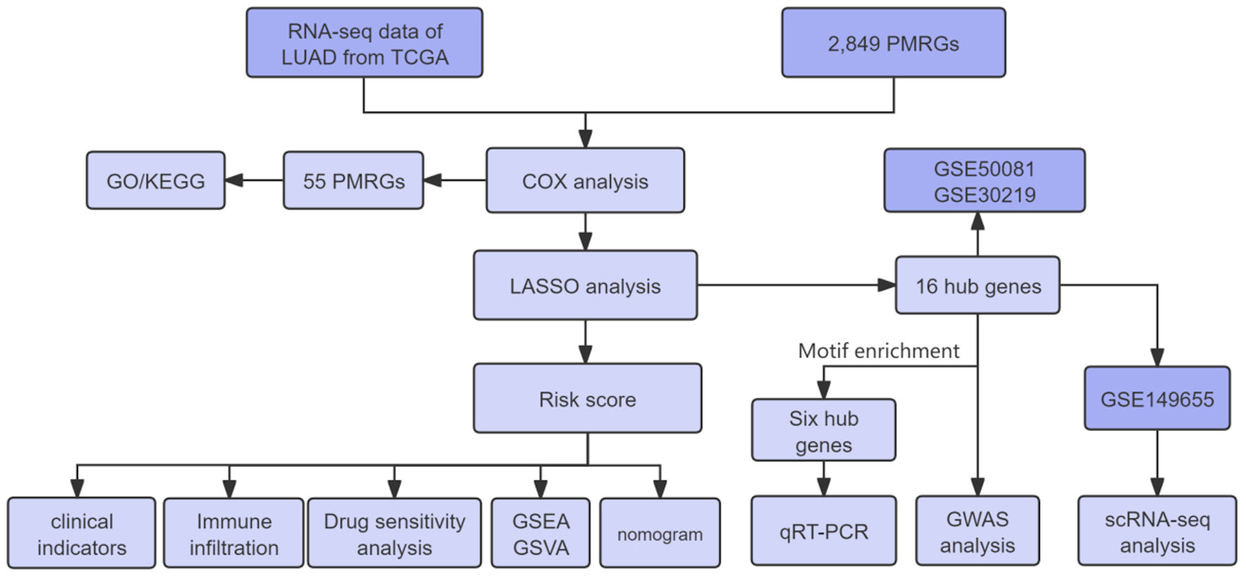
Figures
↓ Figure 1. Overall workflow of this study. LUAD:
lung adenocarcinoma; TCGA: The Cancer Genome Atlas; PMRGs: propionate metabolism-related genes; GSEA:
gene set enrichment analysis; GSVA: gene set variation analysis; LASSO: least absolute shrinkage and
selection operator; GO: Gene Ontology; KEGG: Kyoto Encyclopedia of Genes and Genomes; qRT-PCR:
quantitative real-time polymerase chain reaction.
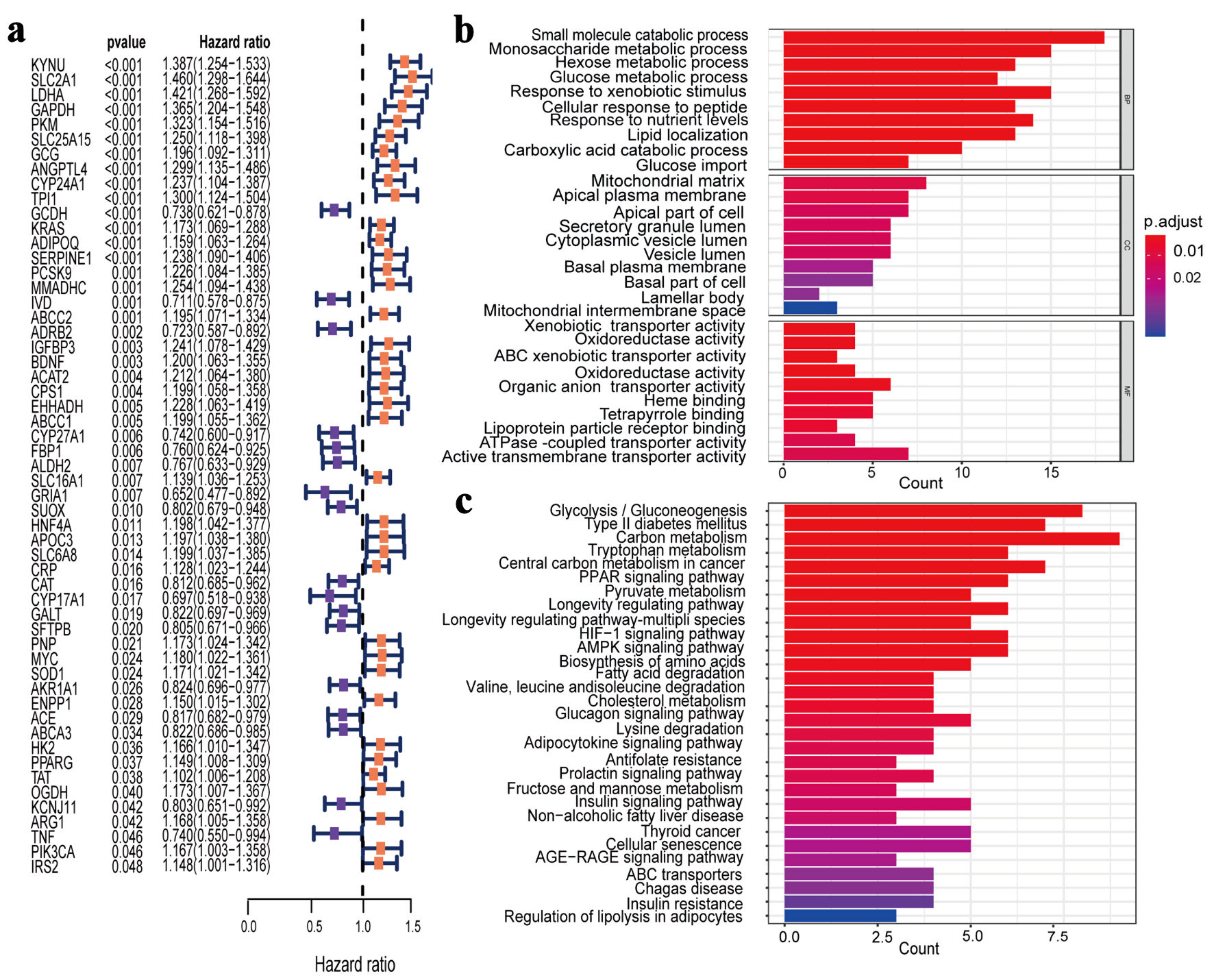
↓ Figure 2. Identification and enrichment
analysis of PMRGs in LUAD. (a) Cox univariate analysis selected 55 PMRGs. (b) GO analysis results for
the 55 PMRGs. (c) KEGG analysis results for the 55 PMRGs. PMRGs: propionate metabolism-related genes;
LUAD: lung adenocarcinoma; GO: Gene Ontology; KEGG: Kyoto Encyclopedia of Genes and Genomes.
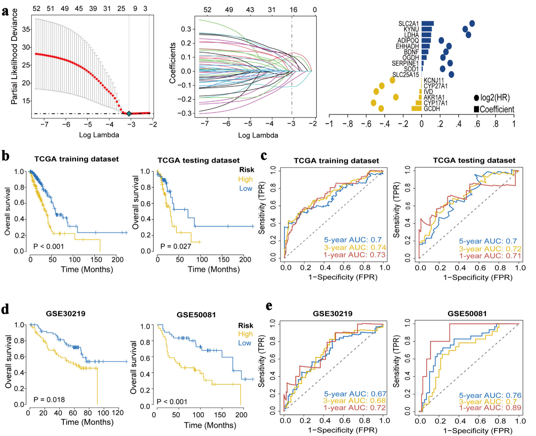
↓ Figure 3. Construction and validation of the
prognostic model. (a) The LASSO regression identified 16 hub genes in LUAD. (b) Kaplan-Meier survival
analysis plot (P < 0.05). (c) ROC curves predicted by the risk score model for 1-year, 3-year, and
5-year OS. (d) Kaplan-Meier survival analysis plot for GEO validation. (e) Survival ROC for GEO
validation. LASSO: least absolute shrinkage and selection operator; ROC: receiver operating
characteristic; OS: overall survival; GEO: Gene Expression Omnibus; TCGA: The Cancer Genome Atlas; AUC:
area under the receiver operating characteristic curve.
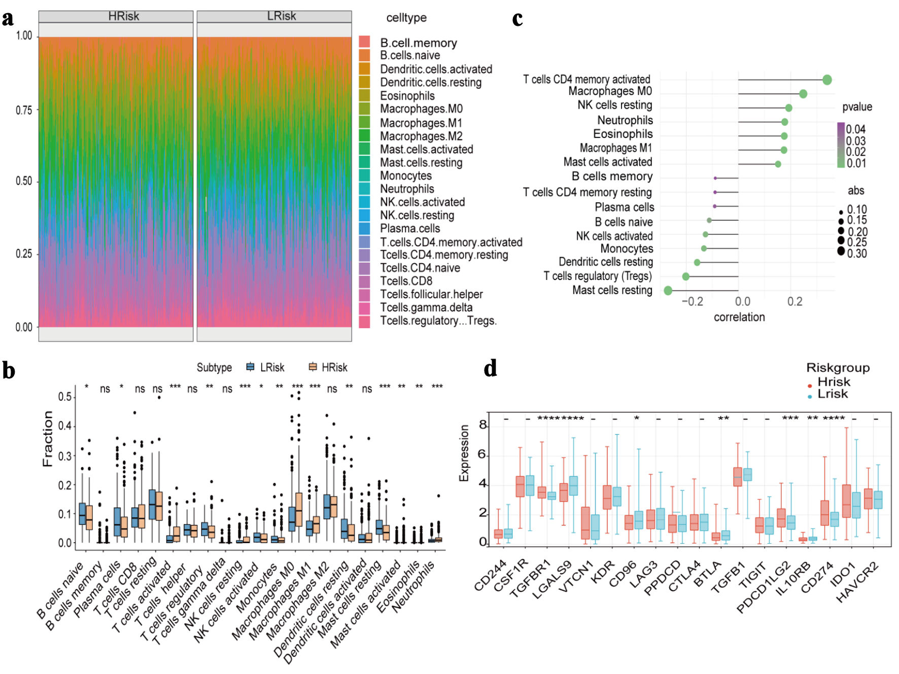
↓ Figure 4. Immune cell infiltration and
immune-related gene expression between high-risk and low-risk groups. (a) Heat map of the proportion of
immune cells. (b) Boxplot of the proportion of immune cells. (c) Correlation analysis of immune cell
content and risk score. (d) Expression differences of immune-inhibitory factors.
↓ Figure 5. Drug sensitivity, specific signaling
pathway analysis and multiple clinical indicators in high-risk and low-risk groups. (a) Drug sensitivity
analysis. (b) Gene set enrichment analysis. (c) Gene set variation analysis (blue bars (t > 1)
indicate pathways more activated in the high-risk group; green bars (t < -1) indicate pathways
more activated in the low-risk group); the two white dotted lines represent the thresholds of t
> 1 and t < -1, which were used to define biologically meaningful differences in pathway
activity). (d) The difference of risk score in fustat, stage, N and T (fustat refers to “survival
status,” N to “lymph node,” T to “tumor,” stage refers to
“clinical staging”). (e) Immunotherapy response.

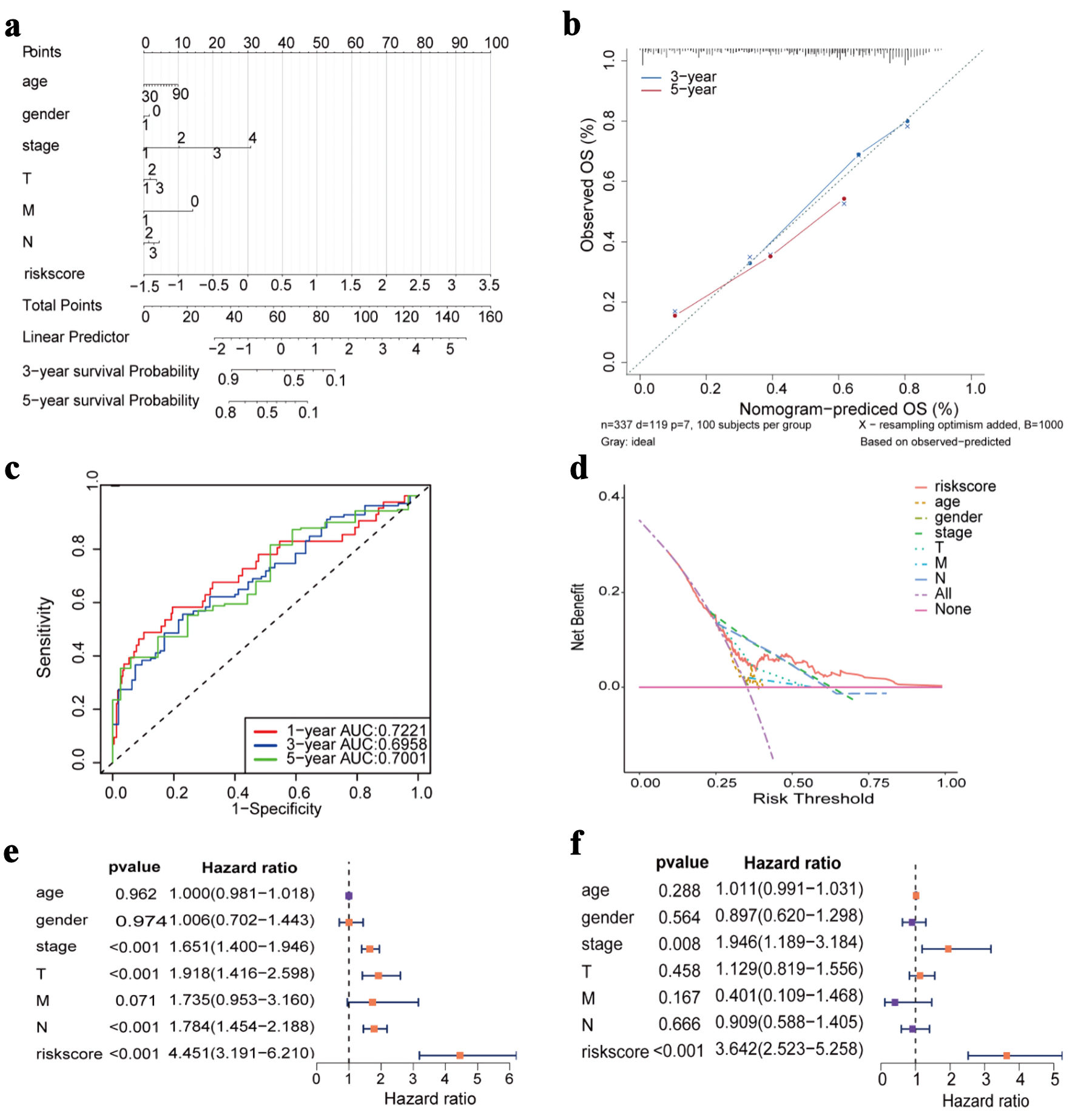
↓ Figure 6. Construction of nomogram and Cox
regression analysis. (a) Nomogram prediction model diagram (each variable corresponds to a point; the
total points map to the survival probability). (b) Calibrated curves for 3- and 5-year specific
survival. (c) ROC curves of the nomogram prediction model. (d) Decision curve analysis for nomogram. (e)
Forest plot of univariate Cox regression analysis. (f) Forest plot of multivariate Cox regression
analysis. OS: overall survival; AUC: area under the receiver operating characteristic curve; ROC:
receiver operating characteristic.
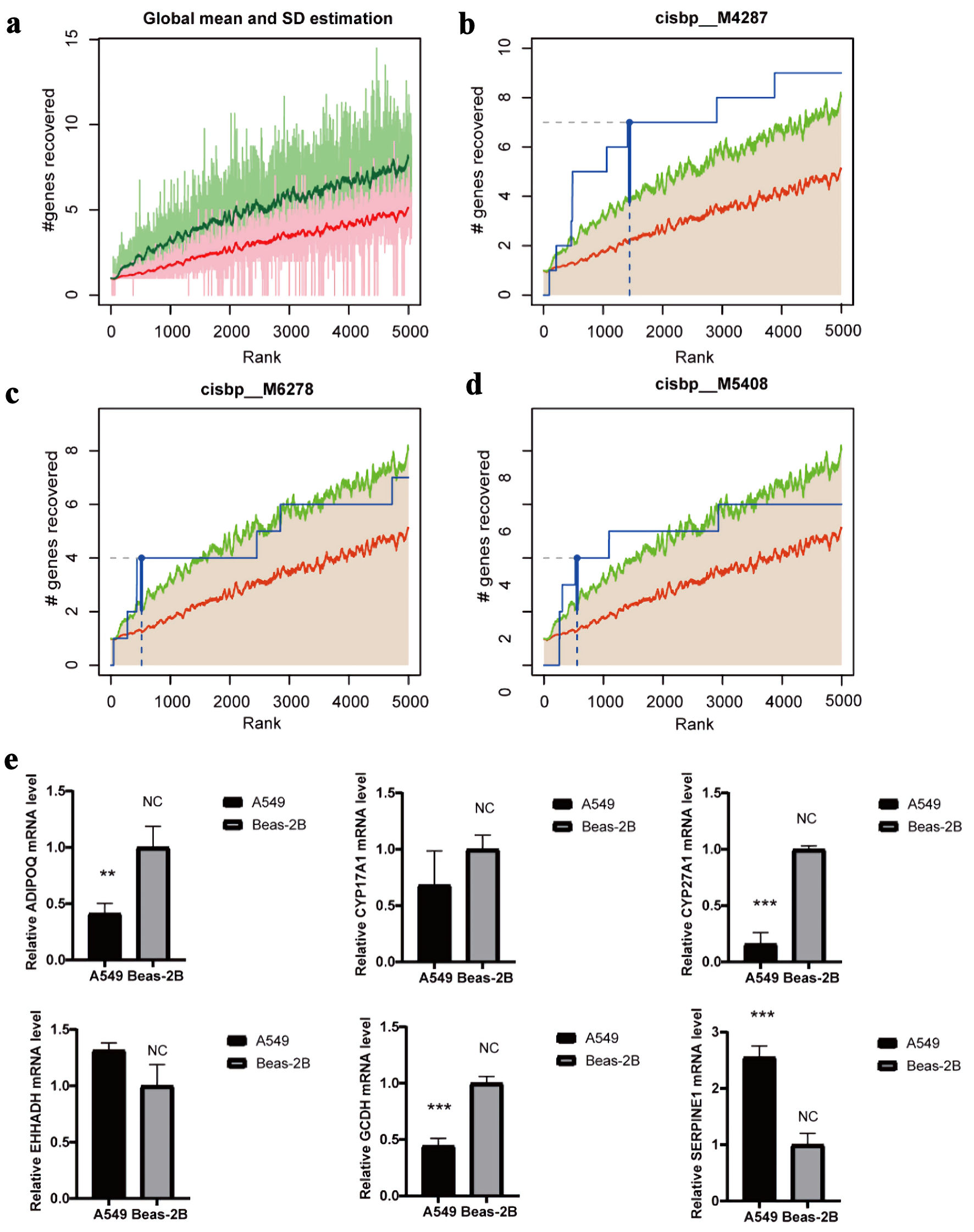
↓ Figure 7. Regulatory network analysis of hub
genes. (a) The enrichment analysis of transcription factors of 16 hub gene by “RcisTarget”
from R package. (b) The motif of cisbp_M4287. (c) The motif of cisbp_M6278. (d) The motif of
cisbp_M5408. (e) The gene expression of cisbp_M4287 in LUAD and normal epithelial cells by qRT-PCR (*P
< 0.05, **P < 0.01, *** P < 0.001). LUAD: lung adenocarcinoma; qRT-PCR: quantitative real-time
polymerase chain reaction.
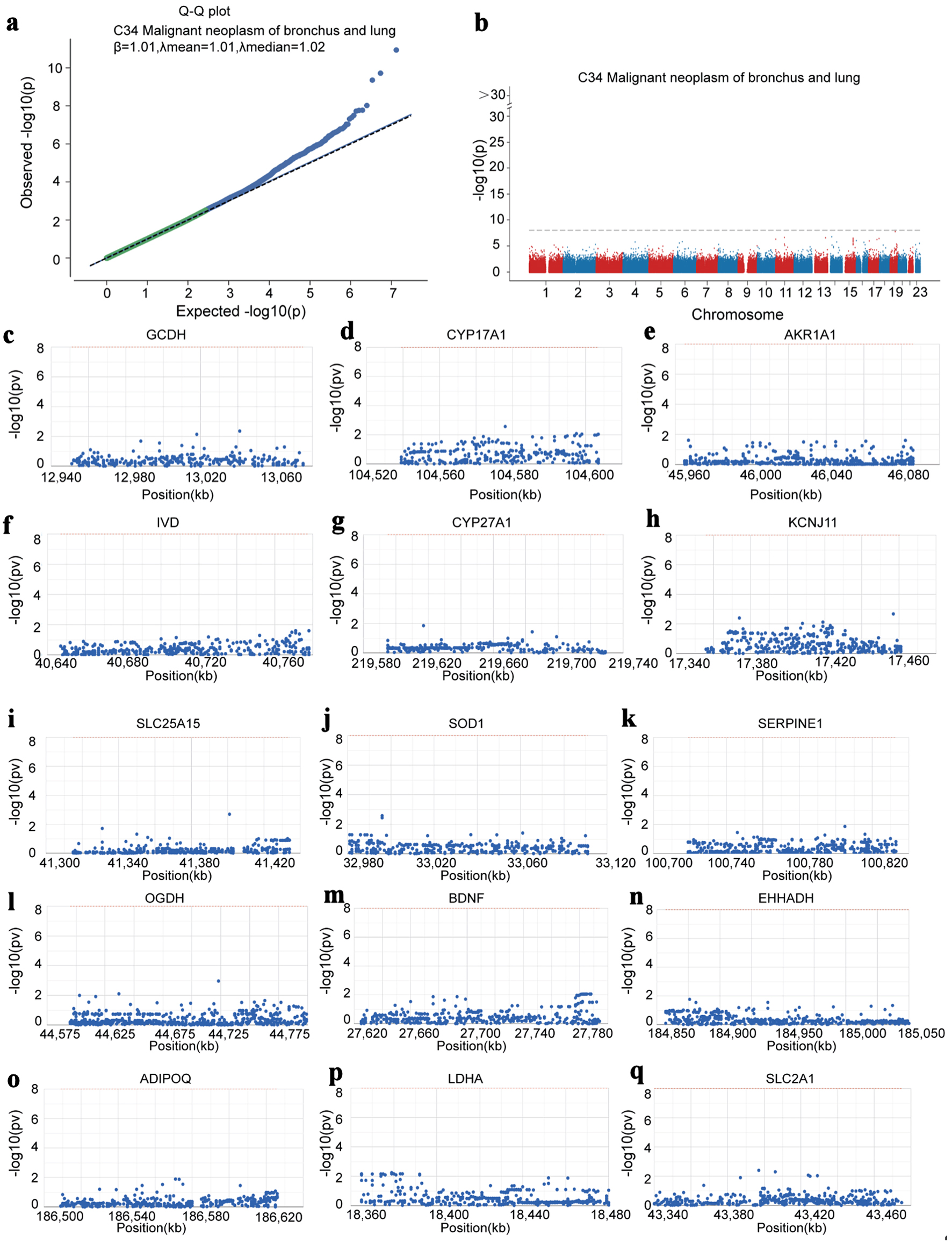
↓ Figure 8. Hub genes identified by GWAS in LUAD.
(a) Q-Q plot showing SNPs associated with LUAD identified by GWAS data. (b) Precise mapping of key SNP
loci distributed within the enrichment regions. (c-q) Locations of the SNP-pathogenic region on the
chromosome of 15 hub genes. GWAS: genome-wide association study; LUAD: lung adenocarcinoma; SNP: single
nucleotide polymorphism.
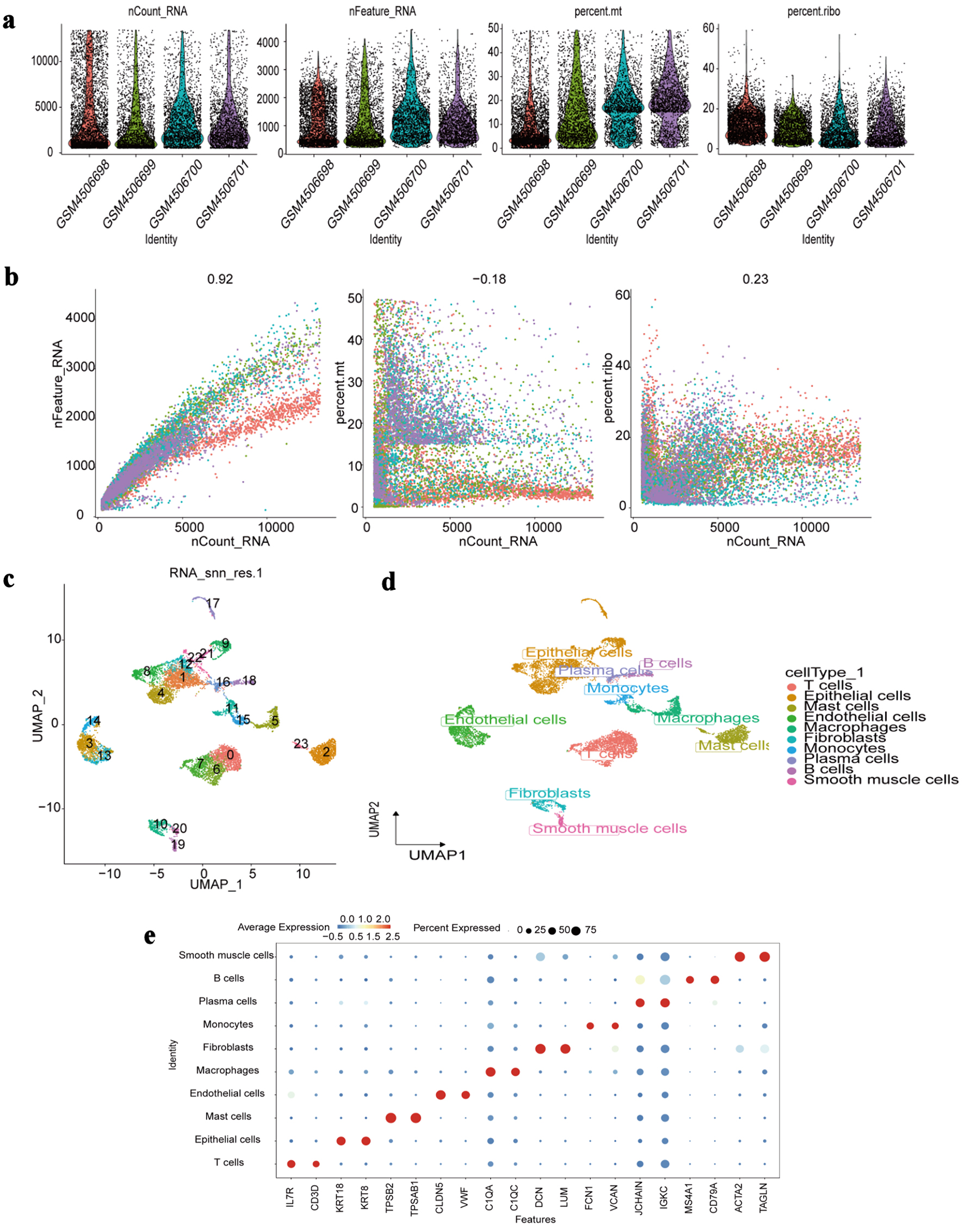
↓ Figure 9. Single-cell RNA-seq profiling. (a)
Distribution of quality control metrics (nCount_RNA: total RNA counts per cell; nFeature_RNA: total
genes detected per cell; percent.mt: mitochondrial gene percentage; percent.ribo: ribosomal gene
percentage) across individual samples (GSM identifiers). (b) Correlations between nCount_RNA and
nFeature_RNA (left), percent.mt (middle), or percent.ribo (right) in all cells. Pearson correlation
coefficients are labeled. (c) UMAP visualization of cell clustering (23 clusters numbered 0 - 22) based
on transcriptomic profiles. (d) UMAP projection annotated by major cell types (T cells, epithelial
cells, etc.) assigned via marker gene expression. (e) Dot plot showing average expression (color
intensity) and percentage of cells expressing (dot size) canonical marker genes (e.g., IL7R for T cells,
ACTA2 for smooth muscle cells) across each identified cell type. RNA-seq: RNA sequencing; UMAP: Uniform
Manifold Approximation and Projection; IL7R: interleukin 7 receptor; ACTA2: actin alpha 2, smooth
muscle.
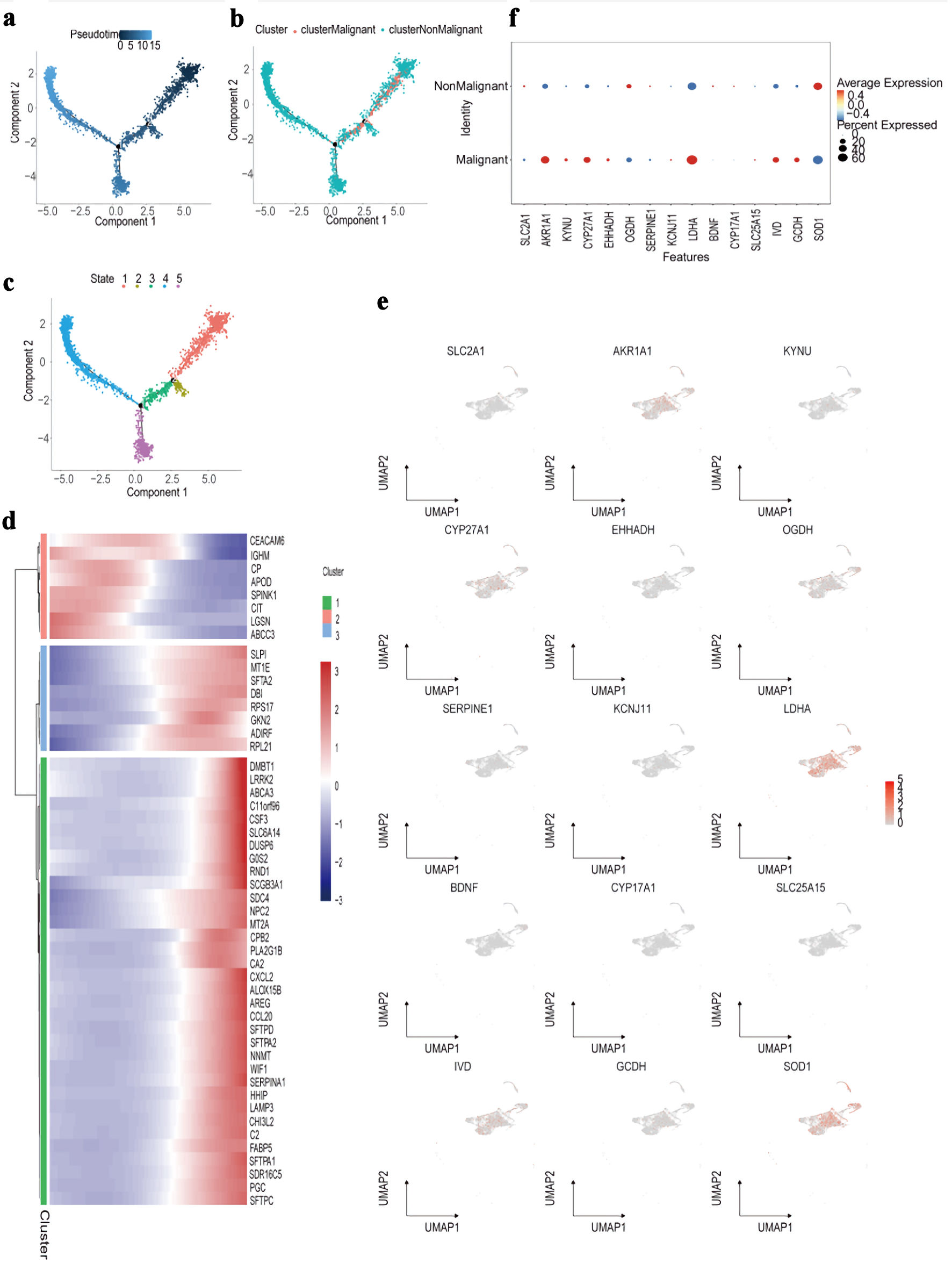
↓ Figure 10. Trajectory and molecular profiling
of malignant vs. non-malignant cell populations. (a) Diffusion map showing pseudotime trajectory (color
gradient) of cells along components 1 and 2. (b) Diffusion map annotated by cluster (colors) and
classification (malignant/non-malignant; point shape). (c) Diffusion map labeling five cellular states
(colors 1 - 5) along the pseudotime trajectory. (d) Heatmap of top marker genes (rows) across cell
clusters (columns), with expression scaled by row (color bar: blue = low, red = high). (e) UMAP plots
showing expression distribution (color gradient: gray = low, red = high) of representative marker genes
(e.g., SLC2A1, LDHA) across all cells. (f) Dot plot comparing average expression (color
intensity) and percent of cells expressing (dot size) candidate genes between malignant and
non-malignant cell populations. UMAP: Uniform Manifold Approximation and Projection.
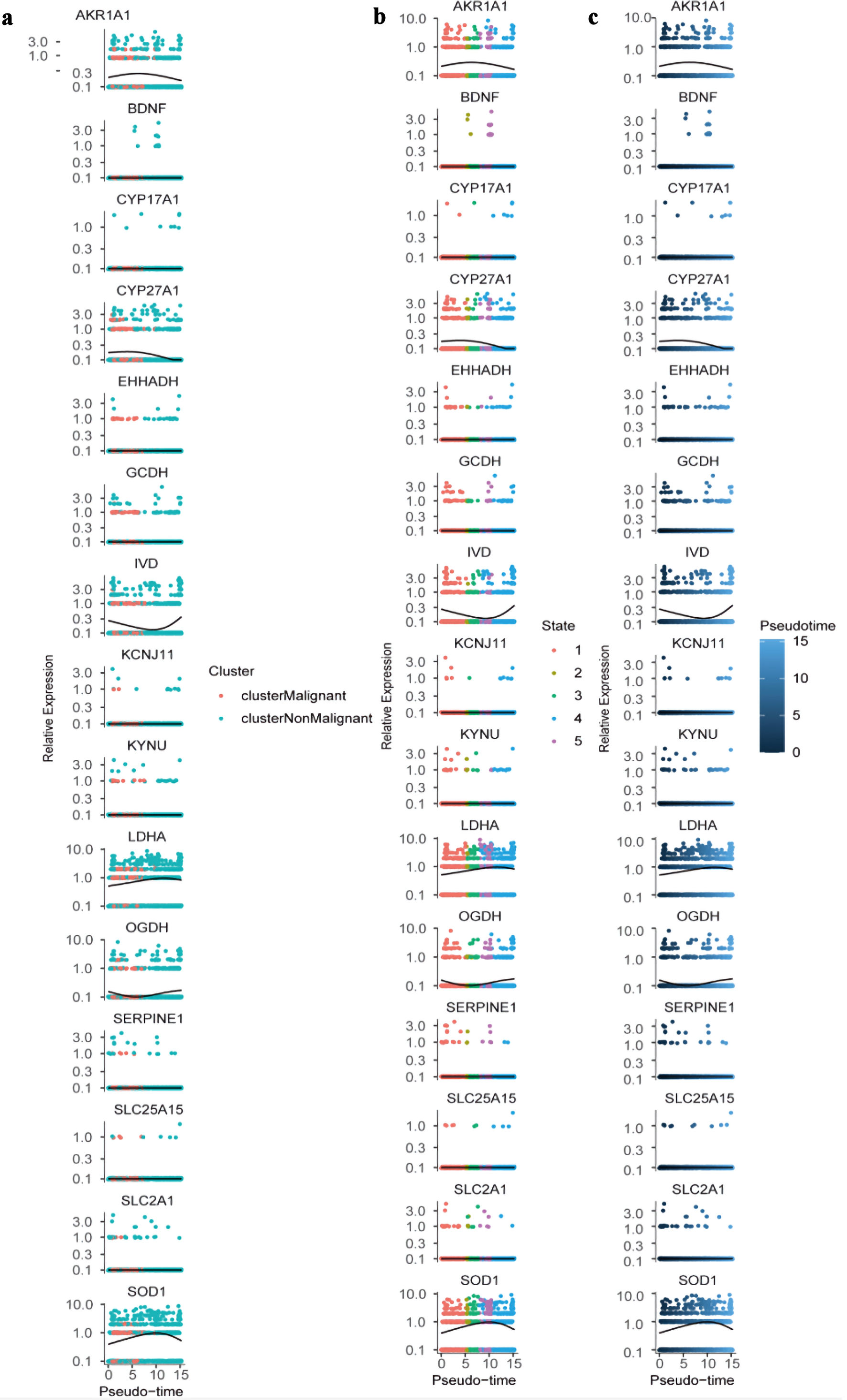
↓ Figure 11. Dynamic expression of hub genes
across pseudotime and cellular states. (a) Colored by cluster identity (clusterMalignant: pink;
clusterNonMalignant: teal), with lines representing trend curves for each cluster. (b) Colored by
cellular state (1 - 5; distinct colors), with lines indicating state-specific expression trends. (c)
Colored by pseudotime (blue gradient; darker = higher pseudotime), with lines showing overall expression
trajectories. All plots use a log-scaled y-axis (0.1 - 10.0) to visualize relative expression
levels.