Figures
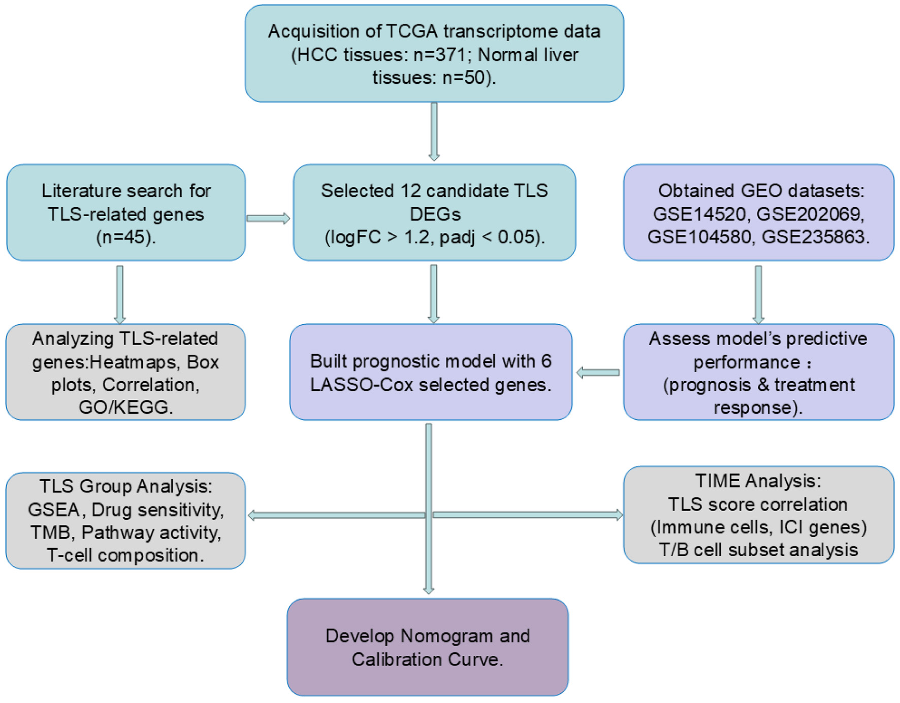
↓ Figure 1. Workflow of the study. Cyan blocks
represent data processing, light purple blocks model validation, gray blocks data analytics, and dark
purple blocks clinical prediction model building.
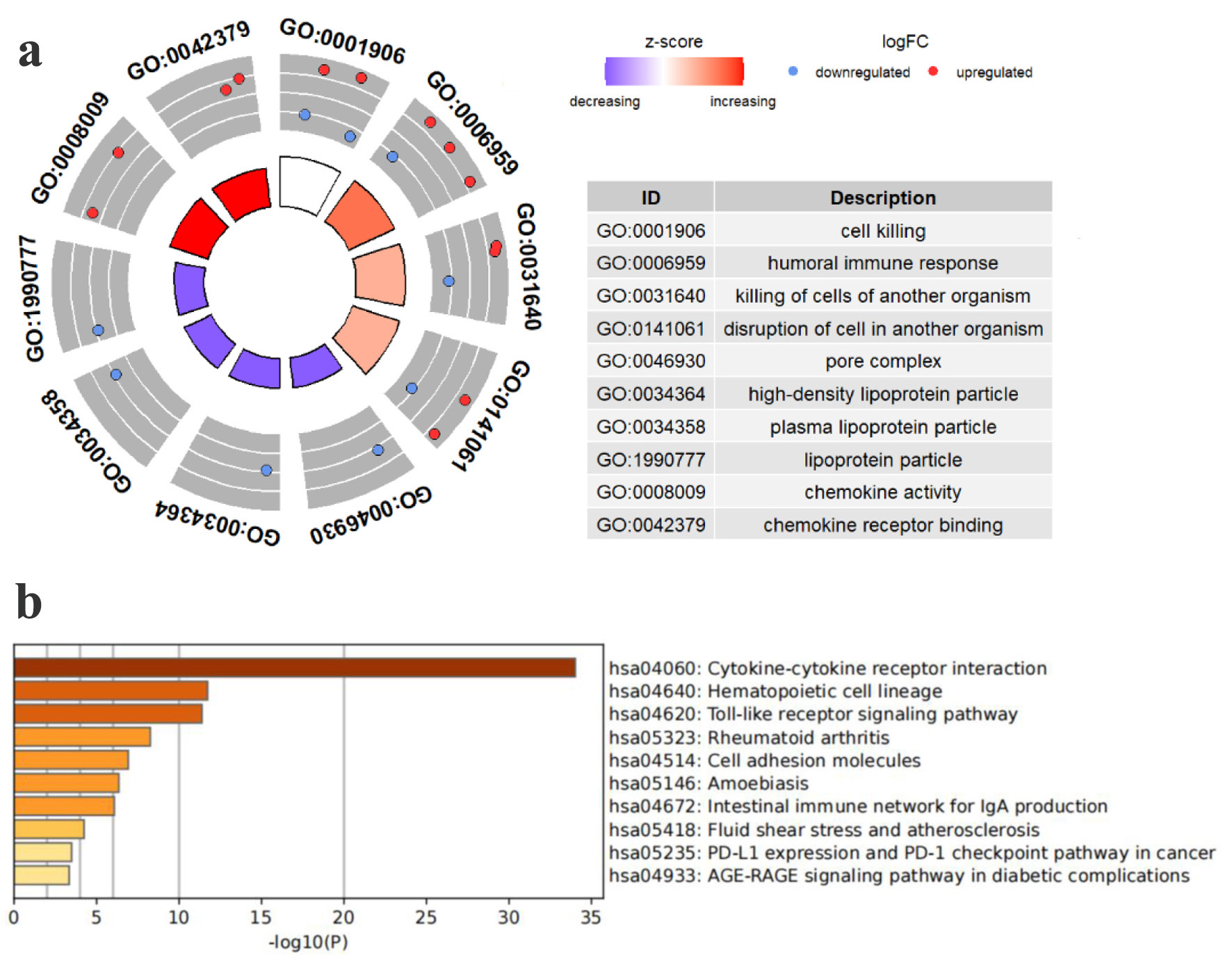
↓ Figure 2. Pathway enrichment study of TCGA HCC
patients’ TLS-related genes. (a) Enriched terms identified in the GO analysis. (b) Enriched
pathways identified in the KEGG.
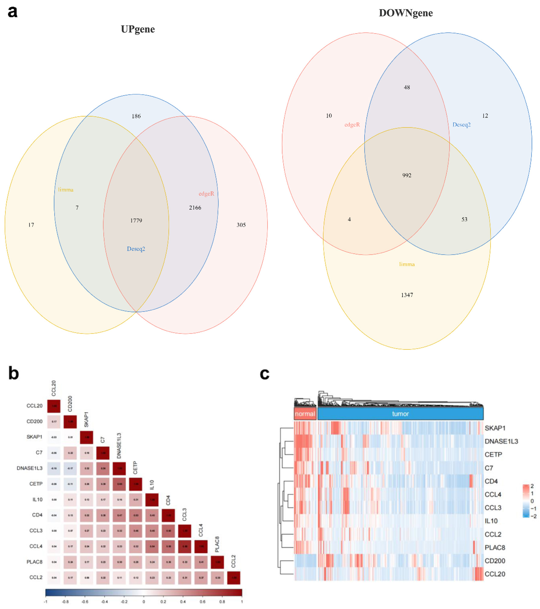
↓ Figure 3. TLS-related gene expression differs
between HCC and normal liver tissues. (a) Venn diagram showing the intersection of differentially
expressed genes identified by Limma (yellow), DESeq2 (blue), and EdgeR (red). (b) Correlation matrix
illustrating the relationships among the 12 candidate TLS-related genes. (c) Heatmap showing normal and
malignant tissue expression of the 12 TLS-related genes. Red means high expression, blue means low
expression, “normal” means normal liver tissues, and “tumor” means HCC
tissues.
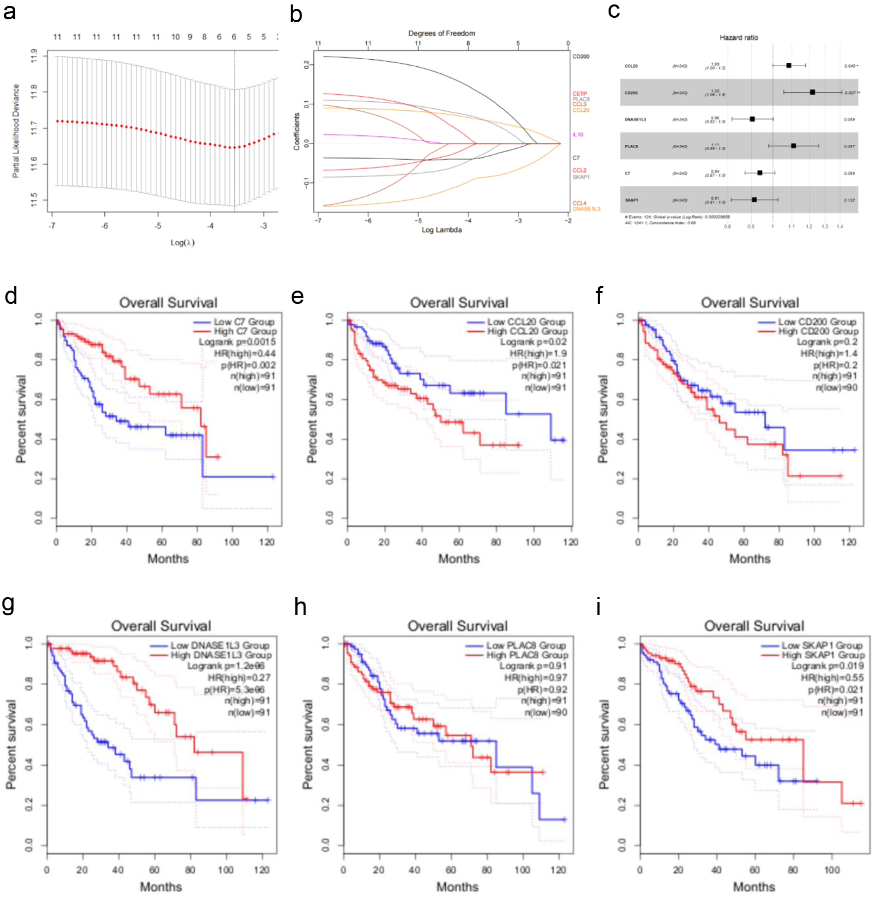
↓ Figure 4. Creating a TCGA cohort TLS-related
gene-based prognostic risk model. (a) LASSO regression analysis of 12 TLS-related genes. (b) Ten-fold
cross-validation for selecting the optimal penalty parameter (λ) in the LASSO regression. (c)
Forest plot showing the hazard ratios and 95% confidence intervals for multiple variables in the
multivariate Cox regression model. (d-i) Kaplan-Meier survival curves illustrating the impact of low vs.
high expression of C7, CCL20, CD200, DNASE1L3, PLAC8, and SKAP1 on overall survival in HCC patients.
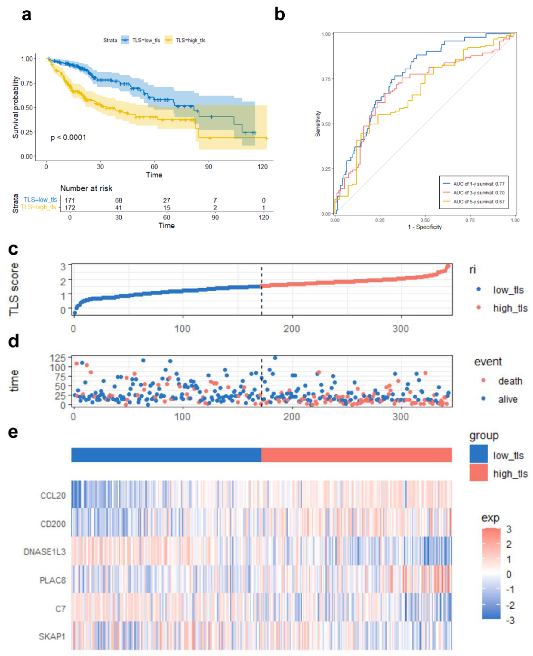
↓ Figure 5. TLS score-based TCGA prognostic risk
model performance. (a) Kaplan-Meier survival curve comparing overall survival between high and low TLS
score groups. (b) ROC curves demonstrating the predictive accuracy of the TLS score for 1-, 3-, and
5-year OS. (c) Median TLS score threshold patient dispersion. The low TLS score group is blue, and the
high group is red. (d) Survival rates of high-risk and low-risk HCC patients. Red means death; blue
means survival. (e) Heatmap of six model gene expression patterns. Low expression is blue, high
expression is red. Below is the TLS group classification: blue for low and red for high.
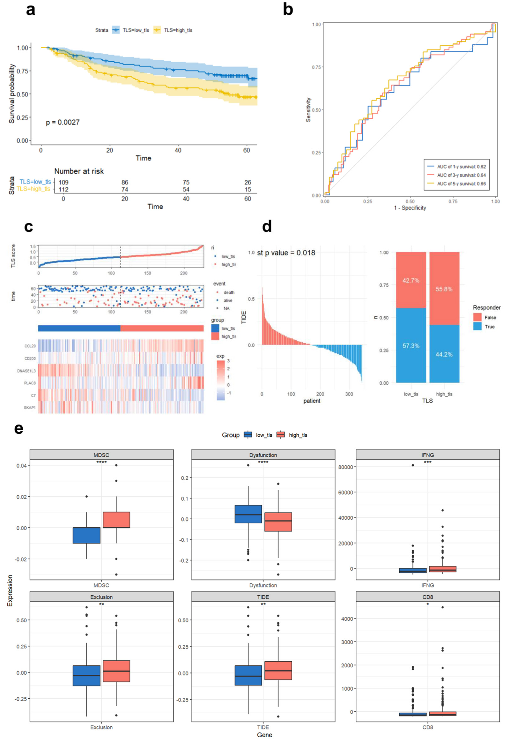
↓ Figure 6. Validation of the prognostic TLS
model in GSE14520 and TIDE immunotherapy response prediction in TCGA. (a) Compared overall survival of
GSE14520 cohort high and low TLS score groups using Kaplan-Meier curves.(b) Time-dependent ROC curves
assessing TLS score prediction power for 1-, 3-, and 5-year survival. (c) Median TLS score threshold
patient dispersion. The low TLS score group is blue, and the high group is red. Blue indicates survival,
red death. The heatmap shows six TLS-related gene expression levels. (d) TCGA sample immune checkpoint
inhibitor sensitivity predicted by the TIDE platform, comparing TLS-defined subtypes. (e) Immunological
differences between high and low TLS scores in TCGA cohort. Dysfunction (T-cell dysfunction score), MDSC
(myeloid-derived suppressor cell infiltration), IFNG (interferon-gamma expression), exclusion (T-cell
exclusion score), and TIDE score (a composite index reflecting tumor immune evasion via T-cell
dysfunction and exclusion, associated with reduced ICI efficacy). CD8 indicates the expression level of
CD8+ T cells.
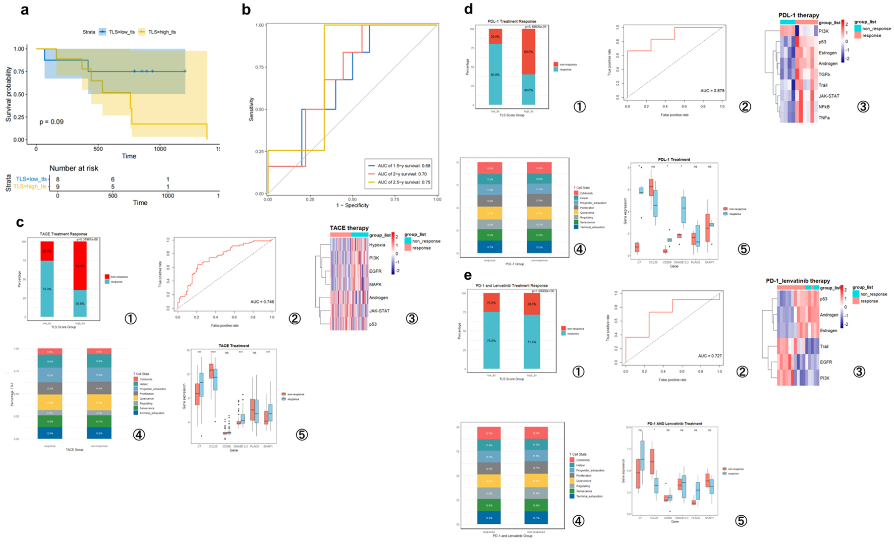
↓ Figure 7. TLS score predicts hepatocellular
carcinoma prognosis and treatment responsiveness. (a) High- and low-TLS score Kaplan-Meier survival
curves for PD-1 treatment patients (GSE202069 cohort). (b) Time-dependent ROC curves analyzing this
cohort’s TLS score predictiveness. (c) GSE104580 (TACE treatment). (d) GSE279750 (PD-L1 inhibitor
treatment). (e) GSE235863 (PD-1 inhibitor + lenvatinib treatment). (c-e) Analysis of the TLS
signature’s predictive value for treatment response in three independent cohorts. For each
cohort, the panels display the following from left to right: the proportion of responders in high- and
low-TLS score groups; the ROC curve for predicting therapeutic response; a heatmap of signaling pathway
activity between responders and non-responders; a bar chart comparing T-cell functional state
proportions; and box plots of the six model gene expression levels grouped by response. T-cell states
include quiescence, regulating, proliferation, helper, cytotoxicity, progenitor exhaustion, terminal
exhaustion, and senescence.
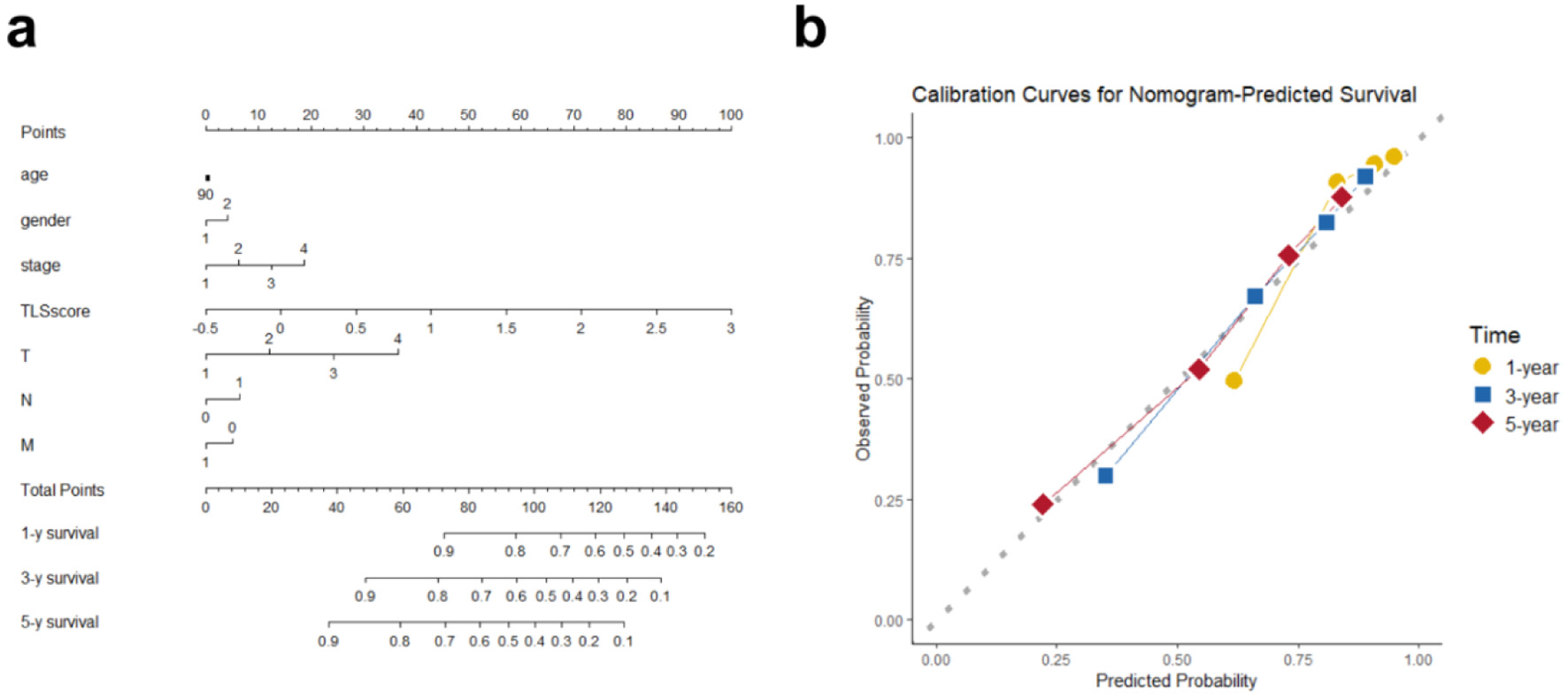
↓ Figure 8. Overall survival nomogram for
hepatocellular cancer patients. (a) Nomogram estimating individual survival odds using TLS score,
clinical, and pathological variables. Any age stage scores 90 points, with gender coded (female as 1,
male as 2). (b) Calibration plots showing high agreement between nomogram predictions and observed 1-,
3-, and 5-year overall survival.
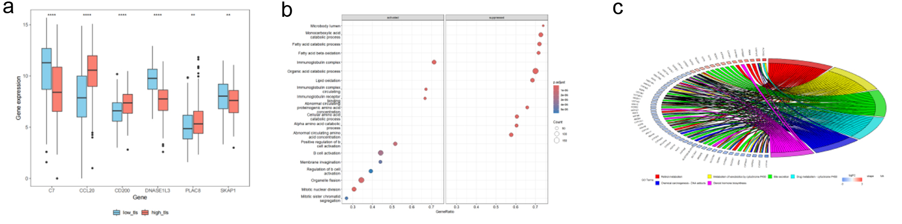
↓ Figure 9. TCGA HCC patient TLS-based subgroup
enrichment. (a) Boxplots demonstrating TLS-related model gene expression differences between high and
low TLS scores. Red boxes mean high-TLS, blue boxes means low-TLS. (b) GSEA bubble plot showing
differentially expressed genes in biological processes between groups. (c) In high and low TLS score
groups, KEGG chord diagrams reveal links between differentially expressed genes (left) and their
enriched pathways (right).
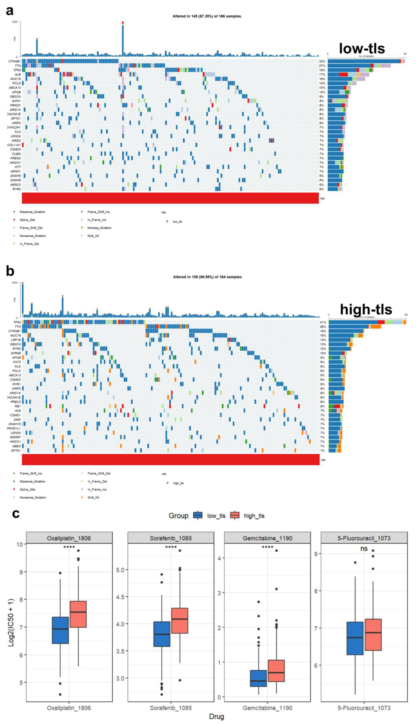
↓ Figure 10. Tumor mutation landscape and drug
sensitivity analysis. (a) Waterfall plot of low TLS score HCC patients’ most commonly altered
genes. Mutation kinds are colored. (b) Waterfall plot of high TLS score HCC patients’ most
commonly altered genes. Mutation kinds are colored. (c) Different TLS score groups’ HCC
medication sensitivity predictions. Oxaliplatin, sorafenib (Sorafenib_1085), gemcitabine, and
5-fluorouracil are sensitive.
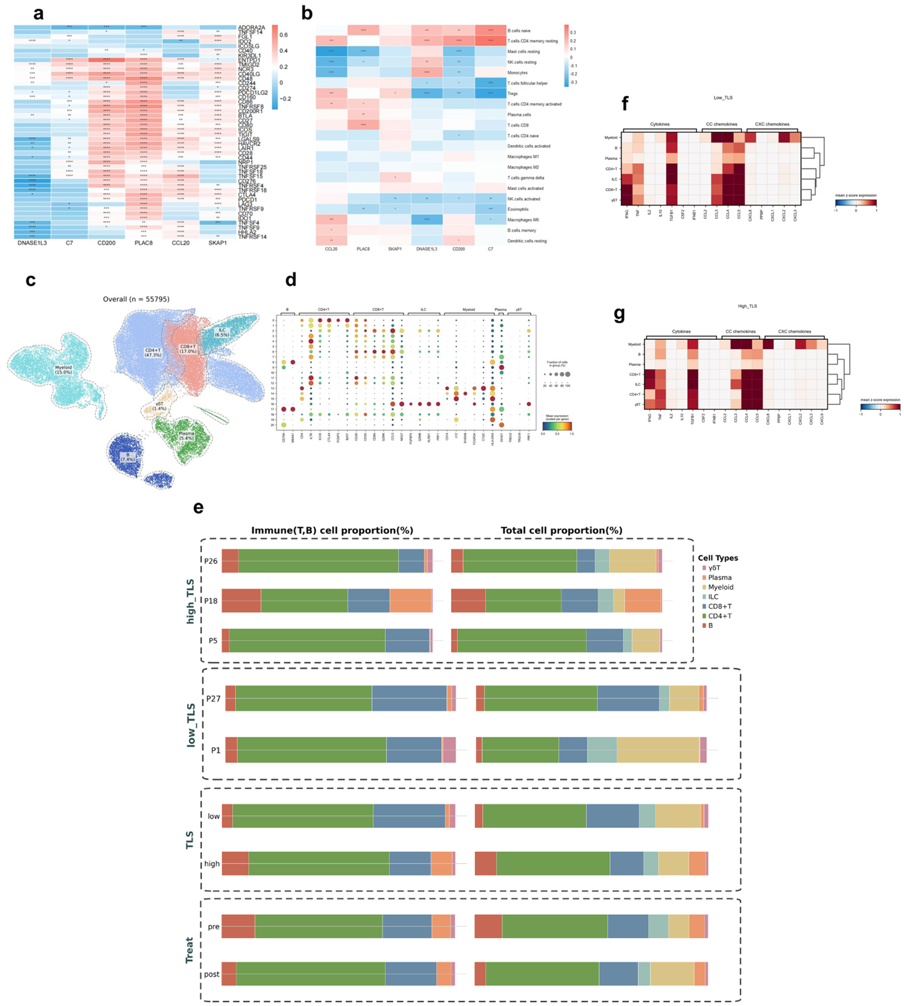
↓ Figure 11. Immune cell infiltration analysis in
HCC. Asterisks indicate statistical significance: *P < 0.05; **P < 0.01; ***P < 0.001. (a)
Heatmap of TLS model gene-immune checkpoint inhibitor gene associations. Positive correlation is red,
negative correlation is blue. (b) Immune cell type abundance and TLS model gene association heatmap.
Positive correlation is red, negative correlation is blue. (c) UMAP map of GSE235863 tumor-derived
immune cells (n = 55,795). (d) Signature gene expression bubble heatmap across immune cell types. Bubble
size indicates cell proportions. (e) Immune cell composition bar graphs. Left panel: T/B cell
proportions; right panel: T/B cell, myeloid, ILC ratio. TLS: overall group comparison; high_TLS: three
high-score samples; low_TLS: two low-score samples; pre- and post-treatment proportions. (f) Low-TLS
score group cytokines, CC chemokines, and CXC chemokines heatmap. (g) High-TLS score group cytokines, CC
chemokines, and CXC chemokines heatmap.
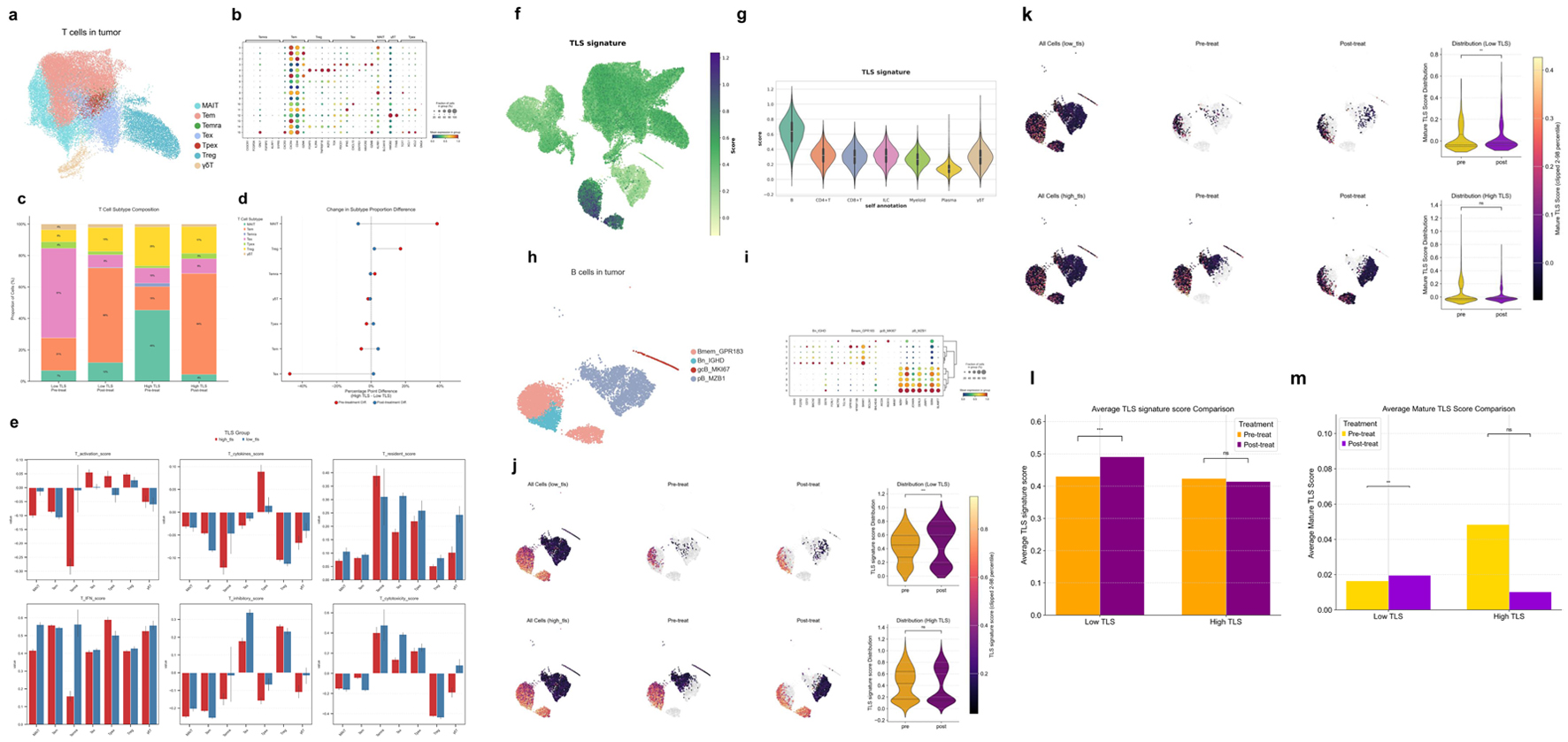
↓ Figure 12. Characterization of T- and B-cell
subsets and TLS-associated features in the HCC tumor microenvironment. (a) UMAP visualization of T-cell
subsets derived from HCC tumor samples. (b) Bubble heatmap of hallmark gene expression in T-cell
subsets. Bubble size shows cell proportion. (c) Stacked bar graphs of high and low TLS score T-cell
subsets before and after therapy. (d) Dumbbell plot showing differences in T-cell subset proportions
before (red) and after (blue) treatment. (e) Functional scoring of T-cell subsets across groups using
various gene sets: T activation score (T-cell activation), T cytokines score (cytokine secretion), T
resident score (tissue residency), T IFN score (interferon response), T inhibitory score (inhibitory
function), T cytotoxicity set (cytotoxic potential). (f) UMAP plot showing TLS signature scores across
different cell populations. (g) Violin plot displaying TLS signature scores across major immune cell
subsets. (h) UMAP visualization of B-cell subsets derived from HCC tumors. (i) Bubble heatmap showing
signature gene expression across B cell subsets. (j) UMAP and violin plots of B-cell subset TLS
signature scores before and after therapy in different TLS score groups. (k) UMAP and violin plots of
mature TLS scores in B-cell subsets before and after treatment in different TLS score groups. (l) Bar
plots showing average TLS signature scores in B-cell subsets across treatment groups. (m) Bar plots
showing average mature TLS scores in B cell subsets across treatment groups.